
Audience: Joomla administrators and site editors who have never used this module before. This guide covers installation, configuration, content sources (folder/manual), layout choices, styling, multi-instance usage, embedding, troubleshooting and recommended screenshots.
Contents
- Requirements
- Installation
- Publishing the Module
- Content Sources: Folder Mode
- Content Sources: Manual Mode
- Layout & Behavior Settings
- Styling & Typography
- Embedding the gallery in articles or templates
- Performance & Security best practices
- Troubleshooting & FAQ
- Quick Start
1. Requirements
- Joomla 6.x (latest patch recommended)
- PHP 8.x (8.0+ recommended)
- Administrator access to install extensions and create module positions
- Familiarity with Joomla Media Manager / file system to create image folders
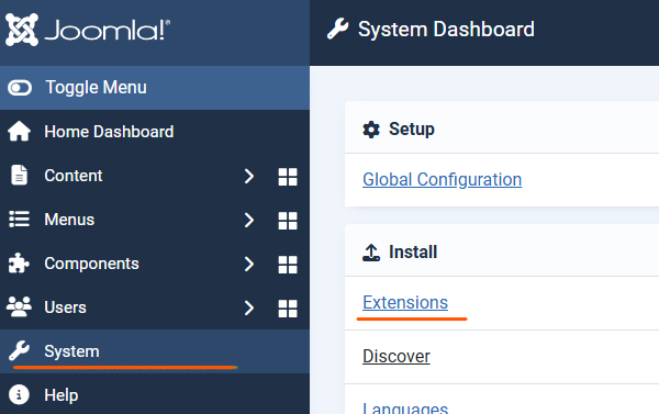
2. Installation
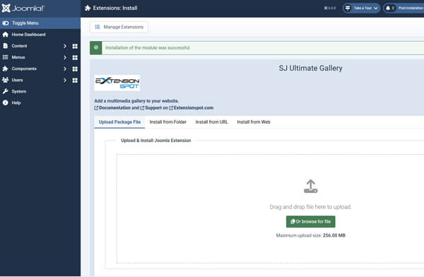
Install the module package via Joomla Installer.
Steps
- Log in to your Joomla 6 Administrator.
- Navigate to System > Install > Extensions.
- Drag and drop the
mod_sj_ultimate_gallery-JX.v.X.zipfile you downloaded onto the upload area. - Once you see the "Installation of the module was successful" message, you are ready to start.
3. Publishing the Module
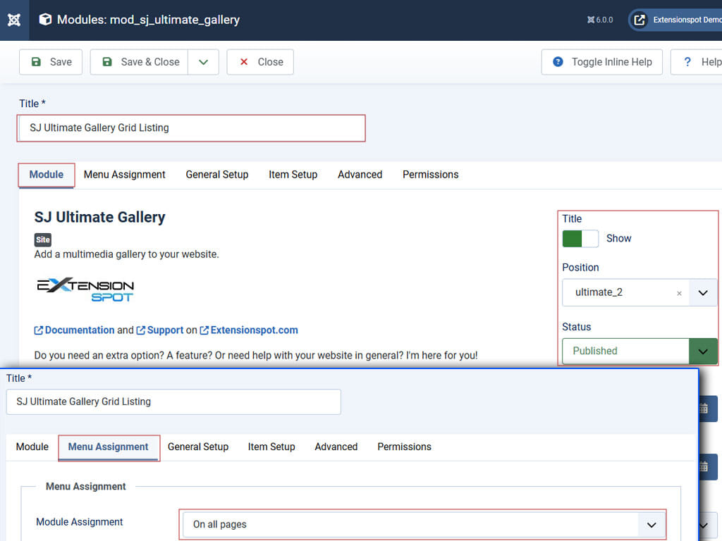
After installation you must create/publish a module instance.
Steps
- Go to Content-> Site Modules
- Click New and choose SJ Ultimate Gallery from the list of module types.
- Configure the basic module settings:
| Field | Suggested value / Notes |
|---|---|
| Title | My Gallery — visible name |
| Position | Your template position (e.g., position-7) or create a custom position |
| Status | Published |
| Menu Assignment | Choose the pages where the gallery should appear |
4. Click Save & Close.
4. Content Source — Folder Mode (Auto)
Folder Mode is the fastest way to create a gallery: point the module to a server folder and it will load items automatically.
Prepare the folder
- Upload your images (and optional thumbnails) to a folder in Joomla
/images/your-gallery/using Media Manager or FTP. - Recommended formats:
.jpg, .jpeg, .png. Keep filenames simple (letters, numbers).
Module parameters (Folder Mode)
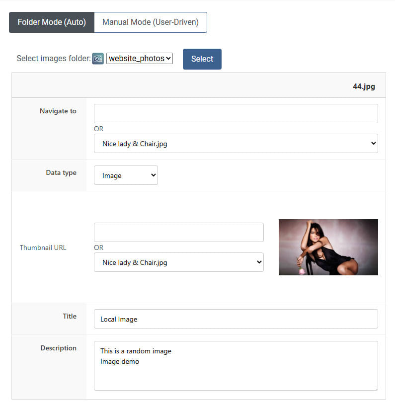
Open your module instance and select Item Setup > Folder Mode(Auto). Configure:
- Folder Path:
images/your-gallery/(relative to Joomla root) - File Types: allowed extensions (default:
jpg,jpeg,png)
After the folder is selected all the images will be loaded into rows.
For each item details can be changed such as:
Navigate to:if you want to point the lightbox to open a different image or locationData type:image, video, web page or google maps - choose this to indicate what type of content will be loaded into the lightboxThumbnail URL:this can be changed also even if by default a different one was loadedTitleDescription
Save the module when finished.
5. Content Source — Manual Mode (Curated)
Manual Mode gives full control — add each gallery item with its own image, thumbnail, title, description and optional video URL.
Adding items
- Open the module and select Item Setup > Manual Mode (User-Driven).
- Use the "Add Item" button to create a new row for each media item.

- For each item, fill fields such as:
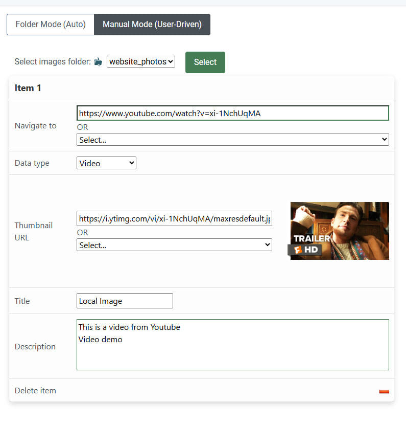
Navigate to:to point the lightbox to open an image or location. Type a location or select an image from the selector.Data type:image, video, web page or google maps - choose this to indicate what type of content will be loaded into the lightboxThumbnail URL:The url of the thumbnail. Type a location or select an image from the selector.TitleDescriptionThe minus icon will delete the current item
- Save the module when finished.
Recommended manual item example
{
  "Navigate to": "images/your-gallery/photo-01.jpg"
  "Data_type": "image",
  "Thumbnail URL": "images/your-gallery/thumbs/photo-01.jpg"
  "Title": "Sunset over the hills"
  "Description": "Captured during golden hour — 50mm lens."
}
For a YouTube video item:
{
  "Navigate to": "https://www.youtube.com/watch?v=xi-1NchUqMA"
  "Data_type": "Video",
  "Thumbnail URL": "https://i.ytimg.com/vi/xi-1NchUqMA/maxresdefault.jpg"
  "Title": "Official Knives Out trailer"
  "Description": "US Release Date: November 27, 2019
Starring: Ana de Armas, Chris Evans, Daniel Craig
Directed By: Rian Johnson
Synopsis: A detective investigates the death of a patriarch of an eccentric, combative family."
}
6. Layout & Behavior Settings
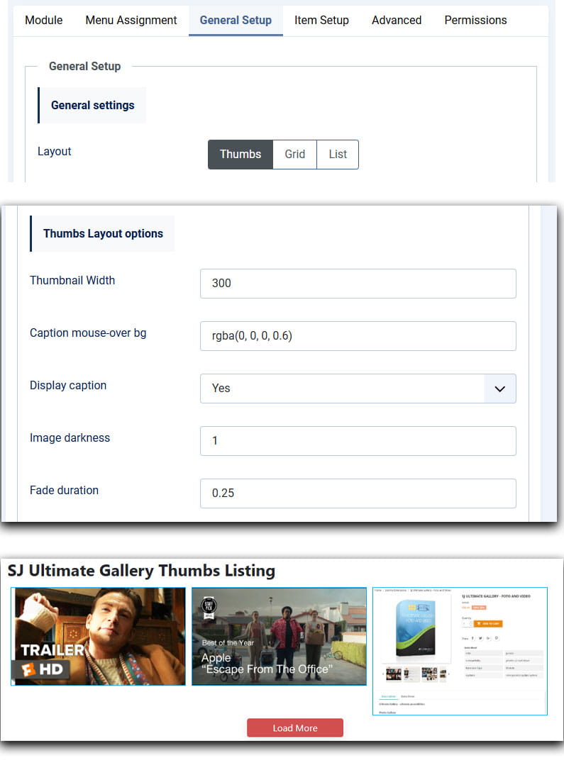
Choose the layout engine and interaction model that best fits your content from General Setup > General Settings.
Thumbs Layout
- Thumbnails with masonry. Best for mixed heights and portrait/landscape images.
- Options: Thumbnail Width, Caption mouse-over background color, Display caption, Image darkness, Fade duration
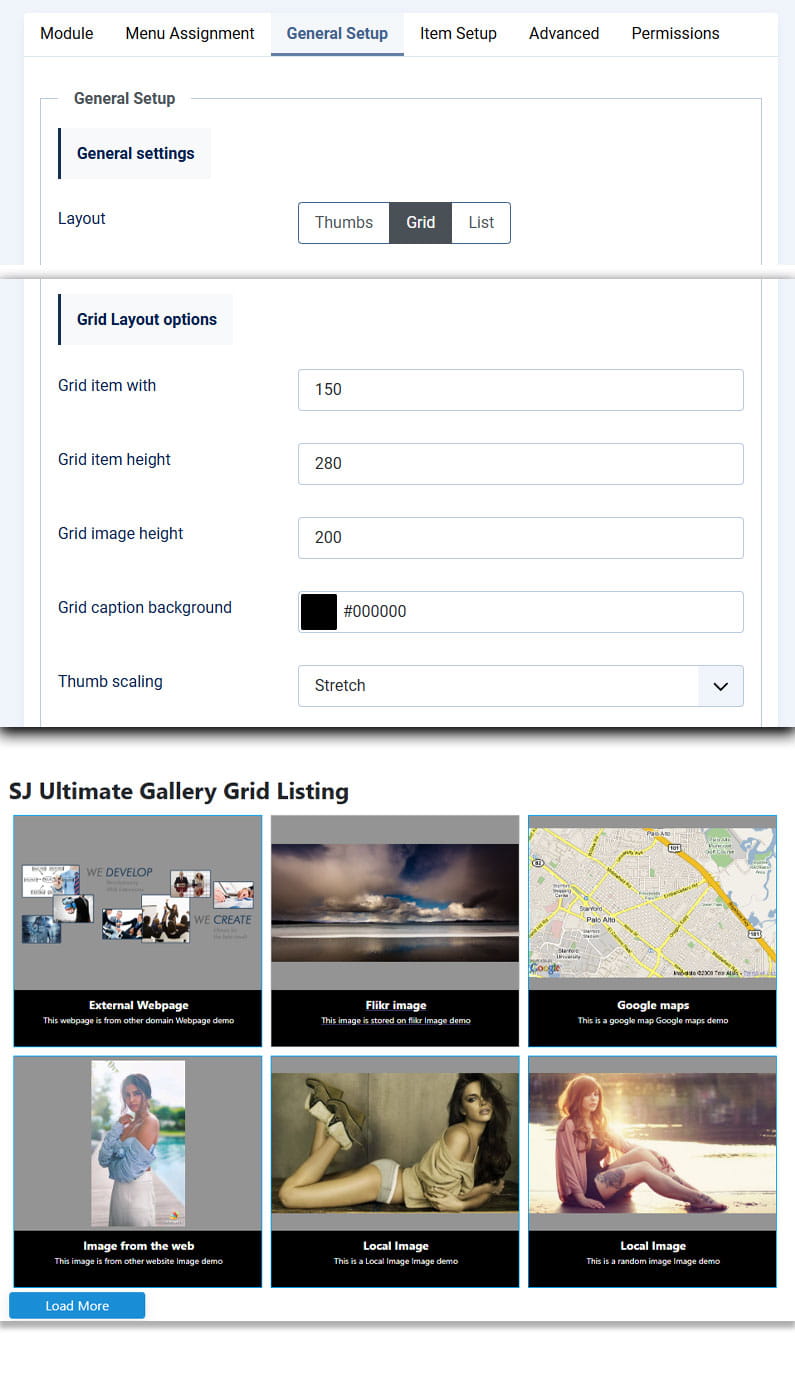
Grid Layout
- Uniform square/rectangular thumbnails for consistent galleries.
- Options: Grid item with and height, Grid image height, Grid caption background color, Thumb scaling
List Layout
- Displays one item per row, with title/description and thumbnail — good for editorial galleries and in-article highlights.
- Options: List thumbnail Width and Height, List column width, Thumb alignment

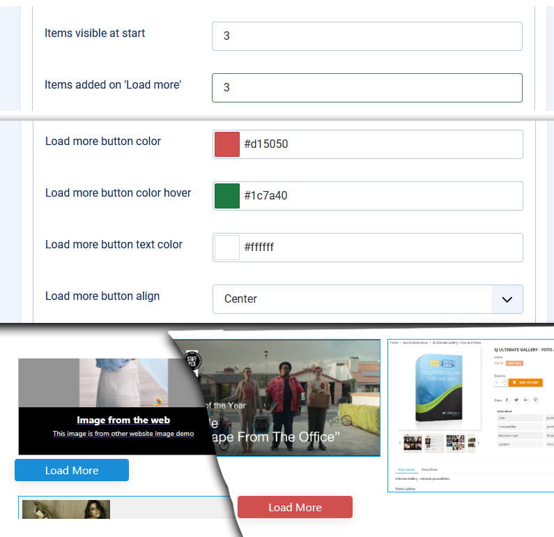
Load More & Pagination
- Items visible at start: number displayed on first load
- Items added on 'Load more': items loaded per click
- Auto-hide button: hides when all items are visible
7. Styling & Typography
Extensive no-code styling options are available. These are applied via generated inline CSS controlled by parameters.
Description Settings
Description font size /Title font size: allows you to set the size for the title and description of the thumb.
Description font weight /Title font weight: you can choose the weight for the font - Normal or Bold.
Description text color /Title text color: allows you to set a color for both the title and the description.
Description align / Title align: you can choose Left, Center or Right.

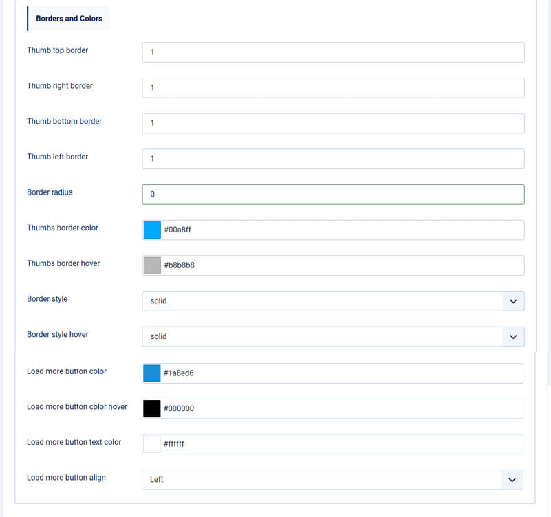
Borders and colors
Thumb top / right / bottom / left border: Set the thickness of the border (increase the value for a thicker line).
Border radius: the more higher the no value, rounder the corners of the thumbs will be. For perfect square, let this value 0.
Thumbs border color: set a color for the border of the thumb.
Thumbs border hover: set a color for the border of the thumb when mouse-over.
Border style / Border style hover: you can select the syle for the border, in both normal and mouse-over state. (solid, dotted, dashed, double, ...)
8. Embedding the gallery in articles or templates
There are two common ways to display the module: by assigning it to a template position or embedding it inside an article using the Load Position plugin.
Method A — Module position (recommended)
- Create or choose a module position and set the module's position field to it.
- Assign the module to the desired menu items.
Method B — Insert inside an article
Use the core Joomla "Load Module" / "Load Position" plugin. Example:
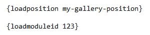
loadposition my-gallery-positionor, if loading by module ID (inside curly brackets):
loadmoduleid 123
Note: Ensure the "Content - Load Modules" plugin is enabled in the Plugin Manager.
9. Performance & Security Best Practices
- Image optimization: Resize and compress images before uploading.
- Lazy load: Use Joomla or module lazy-loading options where available to reduce initial payload.
- Folder permissions: Keep image folders readable but avoid world-writable permissions (use 755/644 typical settings).
- CSP & strict mode: The module uses Joomla Web Asset Manager for scripts to comply with CSP. If you have a strict CSP, ensure Fancybox and Masonry sources are whitelisted when external CDNs are used.
- Sanitization: When adding iframe code, validate the source and avoid untrusted third-party embeds to prevent XSS risks.
10. Troubleshooting & FAQ
Q: The gallery shows blank squares or missing images
A: Confirm the image paths and permissions. If using Folder Mode, verify files are in the folder specified and filenames do not contain special characters. Use the browser console (F12) to check 404 errors.
Q: Fancybox or Masonry is not working or conflicts with other extensions
A: The module uses Joomla's Web Asset Manager to avoid duplicates. If conflicts persist, check for other extensions loading the same libraries incorrectly (multiple jQuery instances). Use the console to find errors and ensure no other extensions call legacy jQuery in noConflict mode.
Q: Multiple galleries on the same page cause behavior issues
A: The module generates unique DOM IDs per instance. Make sure module caching or template overrides are not altering those IDs. Try disabling caching temporarily to test.
Q: Videos don't autoplay or appear cropped
A: Check video URL correctness (copy the standard YouTube/Vimeo URL). For autoplay, ensure browser policies and Fancybox autoplay options are enabled; many browsers block autoplay without user interaction.
Q: I want custom CSS overrides — where to place them?
A: You can add overrides in your template's custom CSS or use the template's "custom.css" file. Prefer not to edit module core files — use template overrides or additional CSS files.
11. Quick Start — Minimal Settings Example
If you want to get a gallery online in under 5 minutes, follow this minimal flow:
- Install module package.
- Upload 12 optimized images to
images/quick-gallery/. - Create new module: Title "Quick Gallery", Position "position-7", Published.
- Set Item Setup > Folder Mode (Auto) > Folder Path:
images/quick-gallery/. - Layout: Thumbs, Items visible at start: 8, Items added on 'Load more': 4.
- Save & Open a frontend page assigned in Menu Assignment.
